Sec. 3 The Basics: Visualization
3.1 Frequency Distribution
The frequency of a value is the number of times it occurs in a dataset. A frequency distribution is the pattern of frequencies of a variable. It’s the number of times each possible value of a variable occurs in a dataset.
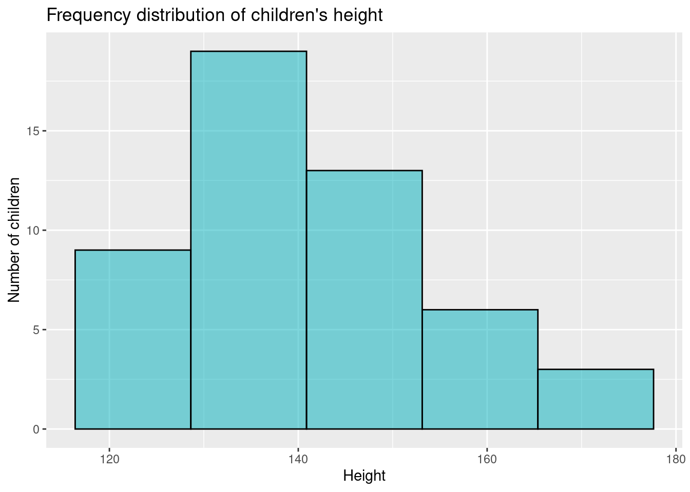
Example: in a given dataset that record the height of 50 children, we can group the data in 6 height categories.
Now, we can build a frequency distribution table, adding the Absolute Frequency (i.e. the number of children within each category) and the Relative Frequency (i.e. the percentage over the total). We will obtain…
| Height (cm) of children | Absolute frequency | Relative frequency |
|---|---|---|
| 120 – 130 | 9 | 18% |
| 130 – 140 | 10 | 20% |
| 140 – 150 | 13 | 26% |
| 150 – 160 | 11 | 22% |
| 160 – 170 | 7 | 14% |
| Total | 50 | 100% |
3.1.1 Graphical representation of frequency distribution
It is important to graphically represent the data and group of data. In this case, frequency distribution can be presented in graphical form as: histograms, bar plot (or bar chart) and pie plot.
Histograms
A histogram is a type of graph in which each column represents a numeric variable, in particular that which is continuous and/or grouped.
Other features:
- The height of the column shows the frequency for a specific range of values.
- Columns are usually of equal width, however a histogram may show data using unequal ranges (intervals) and therefore have columns of unequal width.
- The values represented by each column must be mutually exclusive and exhaustive. Therefore, there are no spaces between columns and each observation can only ever belong in one column.
 Other charts used to represent the frequency are: barplots and pieplot*
- Pieplot are often the worst choice, let’s say that could be graphically pleasant if you need to show your research results to a non-specialized public.